astralglikos


- 21 Ara 2017
- 1,314 Mesaj
Aktiflik
Seviye
Deneyim
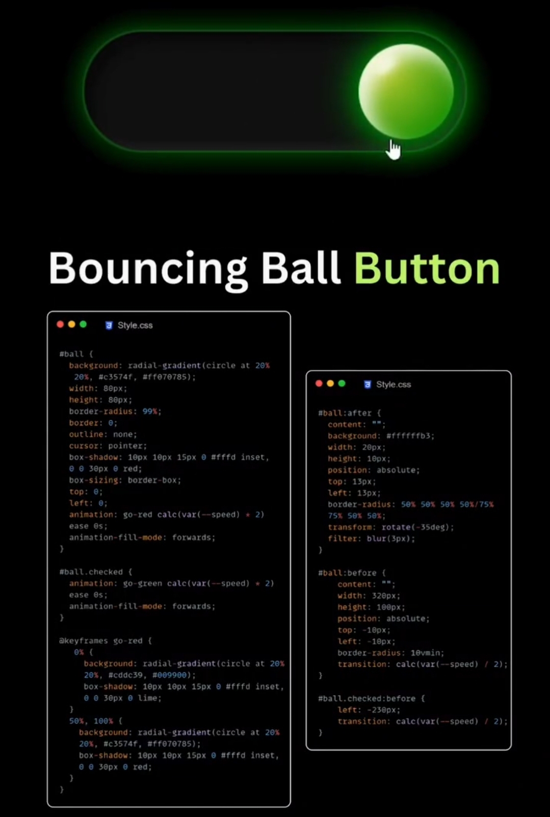
resimdeki kodu yazıya dökecek varmı

|
Aktiflik
Seviye
Deneyim
Aktiflik
Seviye
Deneyim
eline koluna sağlık kardeşimStyle.css
#ball ( background: radial-gradient(circle at 20% 20%, #c3574f, #ff070785); width: 80px; height: 80px; border-radius: 99%; border: 0; outline: none; cursor: pointer; box-shadow: 10px 10px 15px 0 #fffd inset, 0 0 30px 0 red; box-sizing: border-box; top: 0; left: ; animation: go-red calc(var(--speed) * 2) ease 0s; animation-fill-mode: forwards;
#ball.checked animation: go-green calc(var(--speed) * 2) ease s; animation-fill-mode: forwards;
@keyframes go-red ( 0x ( background: radial-gradient (circle at 20% 20%, #cddc39, #009900) box-shadow: 10px 10px 15px 0 #fffd inset, 0 30px 6 lime; 50%, 100% ( background: radial-gradient(circle at 20% 20%, #c3574f, #ff070785); box-shadow: 10px 10px 15px 0 #fffd inset, 0 0 50px 0 red;
#ball:after content: "# background: #ffffffb3; width: 20px; height: 10px; position: absolute; top: 13px; left: 13px; border-radius: 50% 50% 50% 50%/75% 75x 501 50%; transform: rotate(-35deg) filter: blur(3px);
#ball:before content: width: 320px; height: 100px; position: absolute; top: -18px; left: -10px; border-radius: 10vmin; transition: calc(var(--speed)
2);
#ball.checked:before ( left: -230px; transition: calc(var(--speed) /2);
Ne demek hocam ben pek uğraşmadım yapay zeka yaptı zaten sen yinede Bi gözden geçir yanlış tanımlama yapmış olabilireline koluna sağlık kardeşim
Aktiflik
Seviye
Deneyim
yapay zeka işe yazdırdı arkadaş teşekkür ederim@derdomedya yazayim mi gerek var mı?